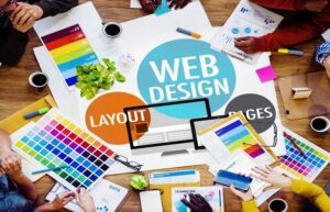
It has already been several months since we announced it to you: the world of the web and technologies is being revolutionized . The arrival of Progressive Web Apps in particular considerably changes the way we use the web, bringing an undeniable influence to the mobile world.
A presence on the web through a computer is essential for your business, but now it is not enough. To stand out, increase interactions and retain your users, it is imperative that you provide them with the best possible experience, both in terms of use and design (icons, illustrations, animations, etc.) strictly speaking. Everyone agrees on this point,in 2018, the user will be placed at the center of the concerns of web designers and this implies new reflexes to adopt, particularly in terms of experience, design, navigation, and interaction.
1/ Bright colors and gradients
This year, Pantone has chosen a very strong color that catches the eye as the color of the year: Ultra Violet . This choice introduces one of the big trends of 2018, which will feature bright colors. Even if you are obviously not obliged to integrate this color into your branding to be trendy, keep in mind that bright tones will be in the spotlight and that they are likely to be very appreciated by your users.
If you don’t feel totally ready to integrate this type of color, the second big color trend should delight you: gradients . Applied in the background, as a filter on your visuals, or in your navigation modes,the gradients will bring the right dose of color to create a minimalist but successful design.
2/ New navigation modes
As we said above, the user is at the heart of the concerns here since new navigation modes are emerging to get as close as possible to the most spontaneous uses: mobile uses . The time of responsive design, which consisted in ensuring that a web page adapts to a mobile format, is therefore completely over to make way for a new mode of operation, thinking directly mobile to extend to larger screens. big .
It is for this reason that, if we used to navigate on a desktop website via categories presented in a classic menu, it is now more intuitive to turn to layouts that use a scrolling system .as a navigation tool. The user therefore finds the main useful information and categories on a single page on which he can navigate with a simple movement: a swipe of the finger. This trend can be associated with a more classic secondary navigation mode, but has the enormous advantage of retaining your users, who will no longer have any chance of getting lost in the architecture of your site/app.
3/ Empty spaces
Here is a trend that, contrary to what you might think, can very easily be combined with the first one we presented to you. White spaces are becoming more and more ubiquitous on the web and it’s not for nothing.
Airing your design without adding too many illustrations will allow you to highlight the elements you want: events to promote, commercial offers, call to action… Keep in mind that the more your page is loaded, the less the attention of your users will likely dwell on the important items. Don’t be afraid of not “filling” all the available space. The white spaces will only reinforce the highlighting of the elements you have chosen , and which you can accentuate if you wish through bold colors.
4/ Sophisticated fonts
2018 is unquestionably the year of typography . Long restricted for the sake of clarity, they are coming back in force to give life and character to web pages, your title or your texts. They are now a design element in the same way as images, allowing you to guide your users and make them easier to read.
Keep in mind, however, that your page should not be overloaded; we therefore forget an image heavy in detail placed in the background of a handwritten font for a text of several lines. Find the right balance and give free rein to your imagination to highlight your content.

